10 Great Examples of Customised Event Pages on Eventbrite
You’ve spent the time planning, creating and organising your event to be as appealing to your audience as possible — why stop at the ticketing page? This is the page that needs to convince customers to purchase tickets, so it’s the perfect opportunity to showcase what they are paying for.
We’re always inspired by the creativity and uniqueness of the events that are on the Eventbrite platform, so we’ve chosen 10 great local examples of customised event pages on Eventbrite to show you what you can do to utilise your event’s ticketing page.
Holi Festival of Colours
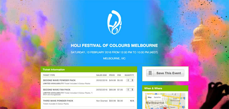
This is a great example of how a bold background image can really highlight what the event is all about. In the case of the Holi Festival, it is all about colour and this vibrant image helps you see what the event experience will be like.
Let Go Fest
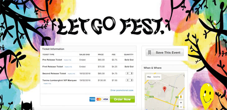
The use of the background image here keeps the theme running from Let Go Fest’s web page to the Eventbrite page. It provides a striking impact and seamless transition, which retains the customer’s trust and attention.
Melbourne International Coffee Expo
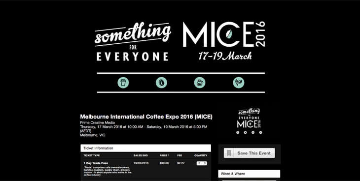
Simple can be effective. This edgy, slick and impactful design tells the customer all they need to know about the event by evoking a bold, no nonsense approach. Less is more in this example.
Wanderlust 108
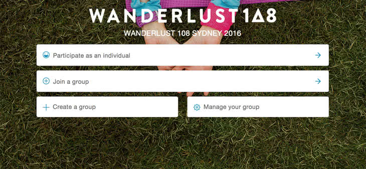
Aside from listing ticket types, here we have an example of how the organisers have utilised the customisable ticketing feature to take different entrants to different tickets, as well as manage groups.
ICMI Women in Leadership
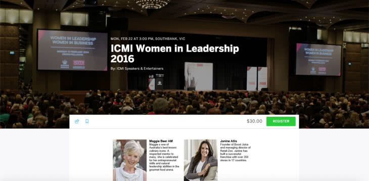
It’s not just festivals getting in on the action. This conference event utilises a past event shot for their header photo and keynote speaker headshots to display exactly what attending this conference will be like and who you will hear from.
Meatstock Pre-VIP Party
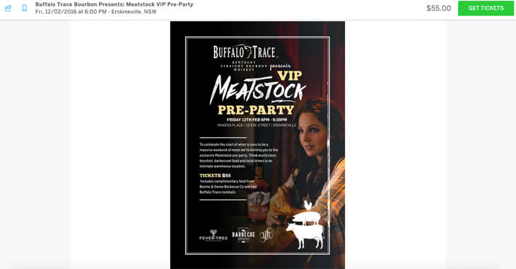
It’s not just about header and background images either. This page has added more information and their poster image in the body of the page to show you what this event is all about. Utilising this space could entice customers to learn more about your event on their path to purchase.
Game of Rhones
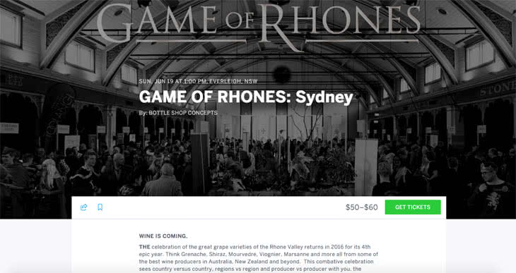
This is a simple and effective use of an image from a past event. Instead of simply using the standard thumbnail image, the Game of Rhones logo is set across an image of a previous event to highlight both the brand and event experience. The black and white imagery matches their event website for another seamless transition between pages.
A Midsummer Night’s Beach Kirtan
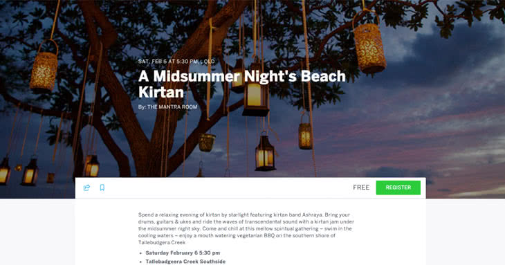
This simple image sets the tone for this event and helps attendees picture the mood of being there.
Global Food Forum
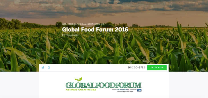
Here is an example of how utilising both a header image and logo inset in the page information can create a striking first impression and encourage attendees to keep reading.
Dog Lovers Show
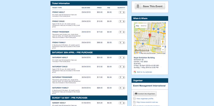
With the ability to add different ticket types, here is an example of how a page that could have looked messy and complicated, is clear and simple. Dog Lovers Show use bold headers to arrange dates and ticket types to prevent confusion.